IEEE Button Design Guidelines
The IEEE brand is an asset. When properly used, the IEEE brand conveys IEEE culture, personality, and values. This is inclusive of not only the IEEE Master Brand, but also color specifications, typography, images, applications, video, social media, and websites.
The IEEE button design guidelines below were created to maintain consistency across all marketing materials keeping in mind the correct use of the IEEE brand.
Importance of website buttons
Website buttons facilitate user interaction by providing simple and efficient means to make choices and take actions. They serve as visual cues to indicate the available options and are strategically positioned throughout the website's interface to optimize their visibility and accessibility. A well-designed button is easy to locate and recognize, and its purpose should be clearly communicated, enabling users to accomplish their intended action with minimal effort.
Buttons can be used for a variety of purposes:
- Calls to action (CTA): Buttons can be used to encourage users to take a specific action, such as “Join IEEE,” "Sign up now," "Learn more," “Contact”, or "Get started."
- Form submission: Buttons can be used to submit information entered into a form, such as a contact form or registration form.
- Social sharing: Buttons can be used to share content on social media platforms such as Facebook, Twitter, or LinkedIn. Note: In some instances this may be in the form of icons or other design elements.
- Downloading: Buttons can be used as cues to download files, such as PDF documents, images, or software.

Website button guidelines
GUIDELINE #1: MANAGE NUMBER OF BUTTONS
Be mindful of having too many buttons.
While it may seem like a good idea to offer users with a wide range of options, having too many buttons can overwhelm and confuse them. Keeping the number of buttons to a minimum and making sure they are easy to find and understand will help ensure a positive user experience.
Prioritize the most important actions and present them in a clear and concise manner. The number of buttons used on any screen depends primarily on the task for the user. Each page on a website should be designed with one or two primary purposes, and a button can be leveraged to create a clear call to action. The exception to this guideline would be e-commerce or transactional applications and websites that would include several buttons (i.e., “Add to cart”) to feature multiple products.
GUIDELINE #2: WORD CHOICE MATTERS
To encourage users to take prompt action, label buttons with the right action. Clearly labeling the intended function of the button allows users to understand its purpose without the need for additional explanatory text.
The action button labels provide clear direction to users, while more generic "Yes/No" button labels do not. Labeling buttons with action can improve task efficiency and enhance the overall user experience.
Choosing the right word(s) is critical when selecting action to label buttons. It ensures that users understand the intended action and can interact with the interface confidently and efficiently. Each action carries a specific connotation and selecting the wrong word can result in unintended consequences.
GUIDELINE #3: CHOOSE ACTIVE, TASK-SPECIFIC LANGUAGE
Choosing task-specific copy using four words or fewer in the active voice creates user confidence as they navigate the interface (Ex: Save, Register, Continue). Using action/command-based button labels helps users trust and understand what you are asking them to do.
However, it is essential to avoid using instructional terms, such as "click here," as they not only add unnecessary words to the label but are also redundant for users. Instead, use unique and descriptive verbs that incentivize users to take action.
GUIDELINE #4: SET THE TONE
Consider the use of sentence case or title case to support readability. The style of capitalization conveys a particular tone to users, which can either attract or turn them away.
Sentence case capitalizes only the first letter of the first word in a sentence and any proper nouns. Title case capitalizes major words and leaves minor words in lowercase.
Users are most accustomed to reading sentences, so when they see sentence case on buttons, it feels less formal and creates a friendly and inviting tone that encourages users to press the button.
If using all caps, the button text should not be more than two words. Any button text over two words should be in sentence case for readability.
GUIDELINE #5: COMPLEMENT WITH COLOR
Use high contrast button color. To ensure that buttons stand out and are easily visible among other elements on a web page, use complementary colors that have a high contrast with the button's surroundings.
Samples of high-contrast complementary color combinations

It is important to keep in mind the size of the button. Smaller buttons require higher contrast colors in most cases.
CTA colors should be selected to complement the aesthetic features of the website. For IEEE websites, the color selection must be in compliance with the IEEE color palette.
CTA colors should be chosen in contrast to the background color they are placed on. The background color contrast must have a ratio of at least 4.5:1 for normal text or 3:1 for large text to pass contrast checks for accessibility. Utilizing the primary color and reversing to white while maintaining the outline of the primary color is a common button type found on a website (i.e., the text “Learn more” on a button would be the same color as its outline).
Website button styles
Utilize the chart below to use IEEE button design styles in your digital marketing materials for website and application design:
| Primary button design | |||
|---|---|---|---|
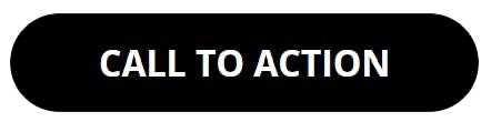
 | Button Function: Continue/Next/Save Example: Magenta solid fill
|
||
 | Suggested hover effect (can be changed based on the website color palette): Example: Black solid fill CSS: |
||
| Secondary button design | |
|---|---|
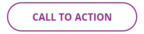 | Button Function: Back Example: White solid fill with magenta outline CSS: |
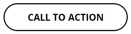 | Suggested hover effect (can be changed based on the website color palette): Example: White solid fill with black outline CSS: |
| Tertiary button design | |
|---|---|
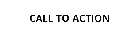
 | Button Function: Cancel Can be a link Example: Any gray from the IEEE color palette CSS: |
 | Suggested hover effect (can be changed based on the website color palette): Example: Black CSS: |
Examples of CTA buttons on website hero graphics:


Email button guidelines
Buttons are a critical component of email design. Effective email buttons are visually appealing and clearly communicate the intended action to the recipient. Here are some key characteristics of effective email buttons:
- Consistent design: The design of the buttons should be consistent. The IEEE button style is pill-shaped with rounded edges and stands out to catch the recipient's attention. Use contrasting colors and bold text to make the button pop.
- Clear and concise text: The text on the button should clearly communicate the intended action to the recipient. For example, instead of using generic text like "Click Here," use more specific text like "Learn More" or "Sign Up."
- Adequate size: Buttons should be large enough to be easily clicked on a mobile device or tablet. They should also be easy to identify on the desktop. Button sizes should be dynamic and resize automatically for the screen they appear on. The recommended minimum size for buttons is 100 pixels wide by 40 pixels high.
- Consistent placement: Place the button consistently in your emails so that the recipient knows where to look for it. You may use more than one button, but filling the email with too many buttons will make the primary call to action (CTA) confusing for email recipients.
- Mobile-friendly: The button should be easy to click on a mobile device or tablet. Ensure that the button is large enough to be clicked with a finger and that there is a minimum of 20 pixels of clear space around it so that it's not accidentally clicked.
Example of buttons:

Digital ad button guidelines
The goal of an effective digital ad is to attract the attention of the viewer, convey a clear message, and encourage viewers to take a specific action (Ex: clicking on the ad or visiting the advertiser's website, drive traffic, generate leads, or increase sales for the advertiser).
To achieve this, a digital ad must have a compelling design, a strong call to action, and be placed in a strategic location that is relevant to the target audience. Additionally, an effective ad should be optimized for the platform on which it will be displayed, such as a website or mobile app, and should be designed to fit within the allotted space and load quickly to avoid losing the viewer's attention.
Use the following best practices for effective CTA placement in web banner ads:
- Use a strong call to action: Your digital ad should clearly state what action you want the viewer to take, such as "Learn more" or "Buy now."
- Keep it simple: Your digital ad should be visually appealing and easy to understand. Use simple, clear images and text that convey your message quickly. The CTA button should always be pill-shaped with rounded edges relative to the size of the ad it is placed on.
- Make it eye-catching: Use bright, contrasting colors from the IEEE approved color palette so that the CTA button stands out.
- Consider placement: The CTA should also appear along the bottom of the ad, with enough clear space that the text in the CTA is legible.
- Test and refine: Monitor the performance of your digital ads and make adjustments as needed to improve their effectiveness.
Examples of digital ads with call-to-action buttons
 |
 |