Global Page Elements and Branding Requirements
IEEE digital publishers are asked to include IEEE-wide styles when structuring and designing site templates in order to create alignment, provide orientation, and leverage the IEEE Brand. IEEE styles are detailed here for use of the enterprise-wide meta-navigation, IEEE Master Brand, footers, GDPR policies, search tools, and favicon in IEEE website headers and footers.
Enterprise-Wide Meta-Navigation
The meta-navigation is a menu that appears on all IEEE websites (enterprise-wide) allowing visitors to quickly access IEEE flagship websites and options.
See guidelines for meta-navigation usage for responsive websites and mobile apps
Requirements for the IEEE meta-navigation are as follows:
- Placement: Outside of the main page above the site header. Within the meta-navigation:
- Site links must appear at the upper-left and flushed left to the edge.
- The upper-right side is reserved for single sign-on links if applicable to a website. To request single sign-on, please work with your IEEE employee representative to initiate a project with IEEE Information Technology. IEEE volunteers can reach out to the IEEE Experience Design Team at digital-innovations@ieee.org to start this process.
- Links: Align site links to the left side of the page in the following order, with the noted destinations:
- IEEE.org: www.ieee.org
- IEEE Xplore Digital Library: ieeexplore.ieee.org (The word "Xplore" must be italicized)
- IEEE Standards: standards.ieee.org
- IEEE Spectrum: spectrum.ieee.org
- More sites: www.ieee.org/sitemap
- Join IEEE: www.ieee.org/join (link must appear on the right side of the meta navigation. This link should be the first link in the set of IEEE SSO links if IEEE SSO links are utilized.) See suggested placement and styling in images below.
- Donate: www.ieee.org/give (link must appear on the right side of the meta navigation. This link should be the first link in the set of IEEE SSO links if IEEE SSO links are utilized.) See suggested placement and styling in images below.
- Size: Minimum height of 30–40 pixels
- Link interaction: Should only underline upon hover and have no "visited" link color change
- Link separation symbol: Should be a vertical bar (l)
- Typography: Open Sans, no smaller than 12px
- Color: Light or dark text can be used depending upon the background color/contrast
Download an HTML code sample of the IEEE meta-navigation (ZIP, 1 KB)
Sample of IEEE meta-navigation:

IEEE Master Brand
The IEEE Master Brand must appear on all IEEE websites, so users are aware that the website is included in the IEEE digital presence, per the below guidelines.
Download the IEEE Master Brand
- Placement: upper-right corner of the header and within the top one-third of the screen view. It can appear either within the meta-navigation bar, or directly below and to the right of the site identifier. See below for visual guidance.
- Size: a minimum of 100 pixels wide by 33 pixels high, and smaller than the site identifier
- Clear space: space around the IEEE Master Brand must be 1/2x where x=the height of the letters I-E-E-E
- Color: either black or white (the blue IEEE Master Brand is reserved for enterprise-level websites and IEEE.org)
- Alternative text: must appear as "IEEE" (without the quotes)
- Hyperlinking: must link back to www.ieee.org and should open in the same window
- Other considerations:
- Ensure there is no white background behind the diamond symbol and never use the IEEE Master Brand as a background, watermark, or wallpaper
- Should not have any modifications or distortions applied (e.g., drop shadow)
- Should be displayed in accordance with the IEEE Brand Identity Guidelines (PDF, 5 MB)
IEEE Master Brand placement examples for websites:

Alternate placement of IEEE Master Brand in the meta-navigation bar. This option should be used sparingly when site designs dictate alternate placement. If this option is used, compliance with IEEE Master Brand guidelines for size and clear space must be maintained per below:


Download an HTML code sample of the IEEE meta-navigation with IEEE Master Brand (ZIP, 4 KB)
Site Identifier
The site identifier is a logo or wordmark (or a type treatment) that must appear on all IEEE websites so users can easily identify which IEEE website they are on.
The site identifier must appear in the upper-left corner of the site header and link to the home page of the site.
Detailed sub-brand logo guidelines and brand-aligned type treatment guidelines are noted below.
Example of site identifier:

- Logos for IEEE Societies, Councils, and other entities such as IEEE affinity groups, or for IEEE products, platforms, and IEEE sponsored conferences, are considered sub-brands and have distinct brand guidelines. Please refer to page 31 in the IEEE Brand Identity Guidelines (PDF, 6 MB) to view the sub-brand Architecture & Alignment Groups grid to determine which format applies.
- Unless the website belongs to an approved IEEE sub-branded entity mentioned above that has its own logo, the name of the site must be included through a brand-aligned wordmark (type treatment) instead of a logo. See brand-aligned type treatment guidelines below.
- IEEE sub-brand logos should include ™ or ® if formally registered.
- The sub-brand logo must contain the letters I-E-E-E and appear larger in size than the IEEE Master Brand to avoid confusion as to which site the visitor is on.
- If your logo has a tagline included, this text can be indicated in a slightly smaller font size under the logo or wordmark, and in italic.
- New logos must be reviewed by IEEE prior to implementation for compliance with the IEEE brand and to ensure that use is permitted to avoid copyright infringement.
- Learn more about logo usage, design, and wordmark styling in the IEEE Brand Identity Guidelines (PDF, 6 MB) under the Sub-Brand Architecture section.
- For questions on IEEE branding, sub-brand logo design creation, or review, please review the IEEE Brand FAQs or submit your inquiry via the IEEE Brand Inquiries Form.
- The type treatment must contain the letters I-E-E-E and appear larger in size than the IEEE Master Brand to avoid confusion as to which site the visitor is on. The letters I-E-E-E must be included in uppercase.
- Text can fit on 1–3 lines depending on the length of copy of the identifier.
- Letters I-E-E-E must be used within the name at same size if on the same line or above. If on a separate line, IEEE can be the same size, or the height of letters can be less prominent (75% of the height of the rest of letters).
- Acronyms used in the name must be spelled out (excluding the “IEEE” acronym).
- If your type treatment has a tagline included, this text can be indicated in a slightly smaller font size under the logo or wordmark, and in italic.
- Color of letters should be IEEE blue, black, or reversed to white if in a colored bar, or they can be one of the approved IEEE color accents where appropriate.
- Overall color use must be from the IEEE color palette.
- Avoid use of more than two accent colors from the IEEE color palette. (Ensure proper contrast is maintained; avoid use of light colors on light backgrounds or dark colors on dark backgrounds.)
- Font style must be Formata Medium or Formata Medium Condensed based on the length of the site name.
- Font sizes should maintain the aspect ratios when used on responsive platforms and should be scaled based on header space available. Examples of wordmark sizes.
- All type treatments for websites must be reviewed as part of the IEEE website review process. Please email exd-team@ieee.org to request a review.
Footer
All IEEE sites must utilize the following guidelines for site footers:
- Administrative links:
- * Home: Link to the home page of the website (should appear as first link)
- * Contact: Link to the contact page/form/email alias for the website or program the website belongs to
- * Accessibility: Link to the IEEE Accessibility Statement page (https://www.ieee.org/accessibility_statement.html)
- * Nondiscrimination Policy: Link to the IEEE Nondiscrimination Policy page (https://www.ieee.org/nondiscrimination)
- * IEEE Ethics Reporting: Link to the IEEE Ethics Reporting Line page (www.ieee-ethics-reporting.org)
- * Terms: Link to the IEEE Terms and Conditions page (https://www.ieee.org/site_terms_conditions.html)
- * IEEE Privacy Policy: Link to the IEEE Privacy Policy page (https://www.ieee.org/about/help/security_privacy.html)
- Sitemap/More Sites: Link to the website sitemap (when available) or to More Sites (https://www.ieee.org/sitemap.html)
- Help: Link to instructional content for the website (if applicable)
- Feedback: Link to form/email alias for users to give feedback about the website (if applicable)
- * Copyright line: © Copyright <YEAR> IEEE – All rights reserved. (Example: © 2021 IEEE – All rights reserved.)
- * Descriptor: A not-for-profit organization, IEEE is the world's largest technical professional organization dedicated to advancing technology for the benefit of humanity.
- Design: Use either a border or a different background color to ensure visual separation between the footer and the page areas above
- Width: Extends the full width of the page (if possible)
* Denotes required administrative links/language in the digital site footer. Do not replicate the policies listed above. Link directly to the IEEE policies. If you believe there is a conflict or that your site has need for a more explicit or restrictive policy, please contact the Experience Design team.
Download an HTML sample of the IEEE footer code (ZIP, 1 KB)
Sample footer:

GDPR Policy Adherence
In addition to the requirement to include the IEEE Privacy Policy, Terms & Conditions, and Nondiscrimination Policy in site footers, all IEEE sites and digital teams are required to adhere to the practices specified within the policies. Sites may not have a unique privacy policy unless it is more restrictive than the IEEE Privacy Policy. In these instances, permission for an exception must be approved by the IEEE Privacy Officer.
Review the IEEE privacy policy
Learn more about the IEEE privacy policy through the FAQ section of the IEEE Support Center
Additional questions related to the IEEE Privacy Policy should be emailed to the IEEE Privacy Officer at privacy@ieee.org.
IEEE cookie banner
In order to comply with the European Union (EU) regulation called the General Data Protection Regulation (GDPR), site managers must implement a banner to their websites that outlines our policy on cookie collection.
Search Tools
Search tools help users find content on a site through the use of a search engine that indexes the content on the site. This tool is most useful when users do not want to browse for content or are unable to find content via browsing.
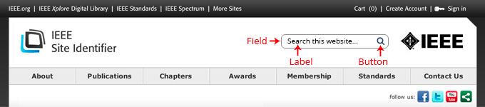
Sample search area using conventional placement in header area of the site:
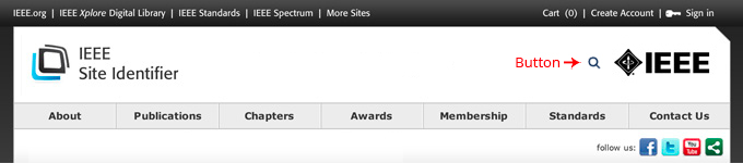
Sample search area with dropdown treatment using conventional placement in header area of the site:
- If used, search tools (field, label, and button) must be placed in a consistent and global area within the digital site’s design.
- Search tools are traditionally placed in the header area of a site or in proximity to the global navigation for quick access.
- Global search tools must appear on all pages of the site for quick access and aid findability of content.
- Other search tools, if warranted, should appear contextually with content on the relevant page(s).
- Global search tools can be presented using either:
- A search field/box (conventional usage)
- A search field/box designed as/alongside a dropdown if providing faceted search options
- Search tools must be clearly visible and recognizable through the use of good recognition aids such as:
- Field labels placed to the left of the search field or inside (note accessibility requirements for placing the label inside). Example: Search IEEE Xplore
- Search button
- Must be placed in close proximity to the right of the search field
- Button label text must say “Search” instead of “Go” or other text labels
- A magnifying glass inside the search field [optional]
- Hint text inside the search field [optional]
- Search tips and advanced search can be included if available.
- When using a magnifying glass, ensure that the code label says “search” and not “magnifying glass”
- Hint text if placed inside the search field must meet the following code requirements to support screen reading software via invisible form labels. Use one of the following three suggested techniques to apply invisible form labels:
1. Hidden <label>
Hide the <label> element off-screen using CSS. The label will not appear visually but will still be read by a screen reader. Create a CSS style called “hidden” and apply it to the <label> element.
HTML<label class=”hidden” for=”s”>Search Terms</label>
<input type=”text” id=”s” name=”s”>
CSS
.hidden
{position:absolute;
left:-10000px;
top:auto;
width:1px;
height:1px;
overflow:hidden;}
2. Title Attribute
If a form field has a title attribute, but no <label>, the screen reader will read the title as if it were a label.
HTML
<input id=”s” type=”text” name=”s” title=”Search Terms”>
3. Aria-label
The aria-label attribute can also be used when there is no text label on the page. Add the aria-label to the input element.
HTML
<input id=”s” type=”text” name=”s” aria-label=”Search Terms”>
Important to note:
- Only one of these recommendations should be implemented. Using two or more together (e.g., a hidden <label> and a duplicate title attribute) can cause information to be repeated by a screen reader.
- Placeholder text (e.g., <input type=”text” placeholder=”Search WebAIM”>) is not a suitable label and should never be used in place of the above techniques.
Resources:
IEEE Favicon
 The IEEE favicon (short for "favorites icon") is a square icon that appears in the address bar for browsers, browser tabs, app icons within mobile and tablet devices, and browser bookmarks as an identifier for a IEEE web page or IEEE website.
- All official IEEE sites are required to use the IEEE favicon, or an approved IEEE sub-brand favicon, as a way to improve user experience and leverage the IEEE brand.
- Color can be customized to align with the color themes of the site. Contact the Experience Design team if approval is needed.
- The IEEE favicon file set contains favicon files for touch icons on iOS and Android platforms as well as .ico file recognized by all browsers.
Download the IEEE favicon file set (ZIP, 221 KB)
View tutorial to add/update the IEEE favicon on your website
Sample favicon usage within a browser:

Site Purpose
The site purpose should be obvious either through the site identifier or through positioning copy placed prominently within the site header. However, if for some reason the site's header cannot adequately convey this information, it should be placed in another prominent position within the home page.
Sample site purpose placement:
Home Page Content Layout Best Practices
All IEEE digital sites should adhere to the following best practices and principles for page layout.
Establish hierarchy to aid readers' understanding and focus
- Place important elements near the top of the page.
- Use headings, subheadings, or bolding for key words, phrases, or topic divisions (but use bold sparingly).
- Use white space to separate topics or to make important elements stand out.
Show relationships between content
- Group similar items together and place them in proximity to each other to show similarity.
- Nest an item under another item to show a child/parent relationship.
Other tips for creating a more readable, interesting page layout
- Break text into short paragraphs or create bulleted lists.
- Incorporate links to other relevant content.
- Use left and right columns for appropriate content.
- Use images, charts, graphs, videos, and/or tables where appropriate to present or support complex information.
Alert messages: Home pages should be designed with a prominent area in which user notifications can be posted by the site owner in the event of an emergency. A process should be in place to ensure that such messaging can be posted or removed in a timely manner.
Sample alert message:

Image carousels: Billboard-like promotional areas may be used on home pages and/or sub pages; however, the following conditions should be met:
- All content should align with the purpose and tone of the site.
- Animation should be user-controlled (advance, pause, stop, play, mute, etc.) and optimized for accessibility and usability. Ensure there is enough color contrast between the controls and the background images.
- Animated frame advancement should allow all content to be read (typically eight–ten seconds).
- Flash files (if used) should be animated at 18 frames per second (fps).
Sample image carousel:
Please reference the sample home page wireframe in the following section as a guideline for how home page elements might appear on an IEEE site.
Sample Wireframes
When planning to create a website, the site's information/design structure is very important. Some tools that could be used in this planning phase are wireframes, visual comps, storyboards, and interactive prototypes. A wireframe is a very basic visual guide used in digital design to lay out a structure. The sample wireframes below illustrate a home page and a subpage that contain the basic design elements that would improve the user experience.
Home page wireframe (left) Lower-level page wireframe (right)

Reviews and Website Evaluations
All new/redesigned IEEE websites should be reviewed by the Experience Design (ExD) team during the following stages: wireframes, visual designs, and prior to launch at the beta URL stage. The ExD review will include prioritized comments on IEEE branding and accessibility requirements, ways to increase the website's usability, and enhancements to the SEO/meta data. These reviews are meant to identify potential opportunities for optimization and to ensure all of the requirements are met prior to launch.
Request an IEEE website review
To learn more, review the following: